
do you need color balanced light to paint?
|
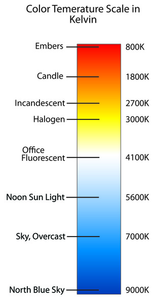
First off, lets discuss what the term color balanced light means. When referring to color temperature, as I mentioned in a previous page, light can vary in how warm or cool it appears. See the image to the right. As measured in Kelvin, an example of warm light would be a typical incandescent lamp at 2700K and cool light, like on a cloudy day outdoors at 7000K - 8000K. These are probably the two extremes most people are common with. Its believed we like warmer lights in the house because for thousands of years, our ancestors relied on the warm glow of a fire for light after the sun went down. I think its pretty common the majority people only use artificial light at night, so an incandescent lamp at 2700K will feel right. But when it comes to a balance of warm and cool, many consider 5000K - 5500K a neutral white. This is probably because the sun is around the same temperature.
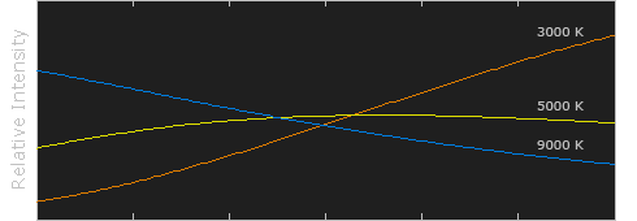


If you compare the spectrum of light output of the different color temperatures in the graph above, you find 5000K to be a fairly level. So this begs the question, do you need to have a balanced light to accurately mix paint to match colors?
|
|
|
|
Many artists recommend using natural light or daylight bulbs which are typically around 5000K - 5500K. The claim is using lights other than those that are a neutral white will result in paintings with inaccurate colors that cannot be displayed in any other light than the light in which it was created. If you ever noticed, red colors tend to be more vibrant in warmer light and the same is true for blue colors in cooler light; referencing the graph above, this makes sense. In warmer color temperature light such as an incandescent lamp, there is more red wavelengths present. However, if the same red color is removed from the warm light, into cooler light like one would find on a cloudy day outside, it will appear duller. Most artists find a happy medium by using daylight bulbs in the studio. At around 5000-5500K the spectrum is pretty well balanced. Before I go on, I should mention that natural daylight is constantly changing. Depending on the type and time of day it is, there is quite a bit of variation. When the sun is low in the sky during either sun rise or sun set, it appears very warm. This time of day is referred to as the golden hour with a color temperature around 3000 - 4000K. The sun doesn't actually change in color but appears to because its rays pass through much more atmosphere at this time of day than any other. The result is a warmer sunlight. If you want to photograph a landscape of seascape, this is the time to do so. The low sun creates a dramatic glowing light that is complimented with cool shadows. But this light is short lived. For most of the day the you can measure the outside color temperature on a sunny day from 5000 - 6000K. But if its overcast or cloudy, expect cooler light around 7000K - 8000K, in some cases even cooler. So if an artist is working from natural daylight, how can he or she ever expect to achieve accurate colors on the canvas if 5500K is the only light suitable for color matching?
In my opinion, there is nothing magical about daylight bulbs. If you are accurately judging color relationships within a painting, you will not have any problems. Of course colors will differ in different lights and as an artist, you must accept it. I suppose you could argue warm colors such as yellow, orange, and red look better in warm light and cool colors such as purple, blue, and green look better in cool light. But regardless of the color temperature of the light, a properly executed painting should be able to live in any illumination. If you ever expect to show your work in exhibitions, get comfortable with showing them in halogen lights - these tend to be the norm in art galleries and museums. But no matter the light you used to create your painting, the colors used should all be relative to each other. As long as the colors were accurately matched from your subject or reference, they will remain true to each other in any light.
|
I believe the most common reason for inaccurate and unintentional color making decisions is from an inadequate amount of light; not because of the color temperature. For example, have you ever noticed how vibrant the color of objects appear in a dimly lit room? Of course you haven't. In order for us to see color, there needs to be light. Without enough light, color matching your paint to a subject of reference is difficult.
The human eye has two types of photoreceptors in the retina, rods and cones. The rods allow us to see values of light while the cones are sensitive to color. There are about 120 million rods and 6 to 7 million cones in the eye. This means we are much better at detecting changes in value and the amount of light than we are at seeing colors. In order for us to detect color, there needs to be decent amount light for the cones to function.
The human eye has two types of photoreceptors in the retina, rods and cones. The rods allow us to see values of light while the cones are sensitive to color. There are about 120 million rods and 6 to 7 million cones in the eye. This means we are much better at detecting changes in value and the amount of light than we are at seeing colors. In order for us to detect color, there needs to be decent amount light for the cones to function.
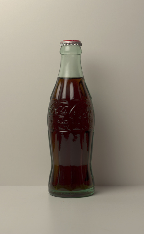
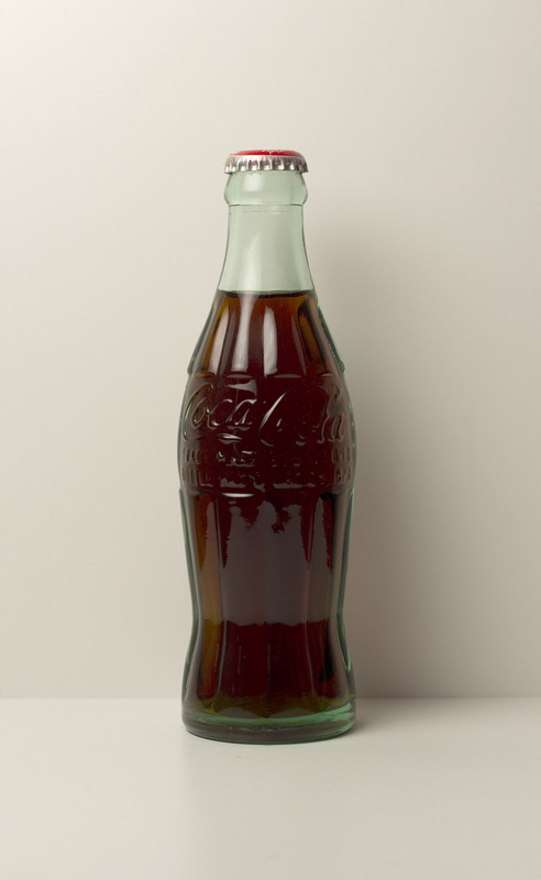
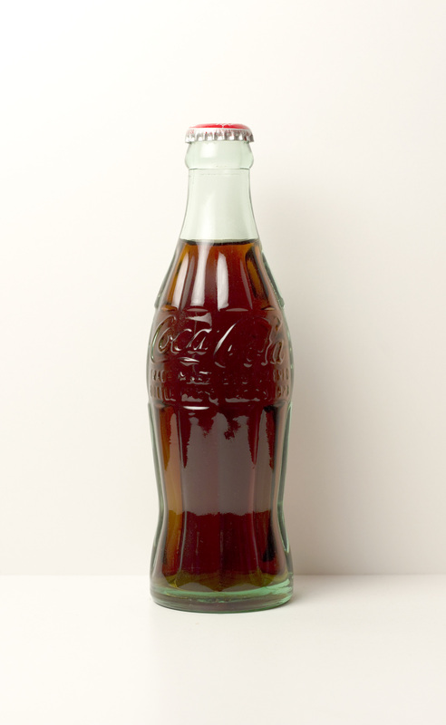
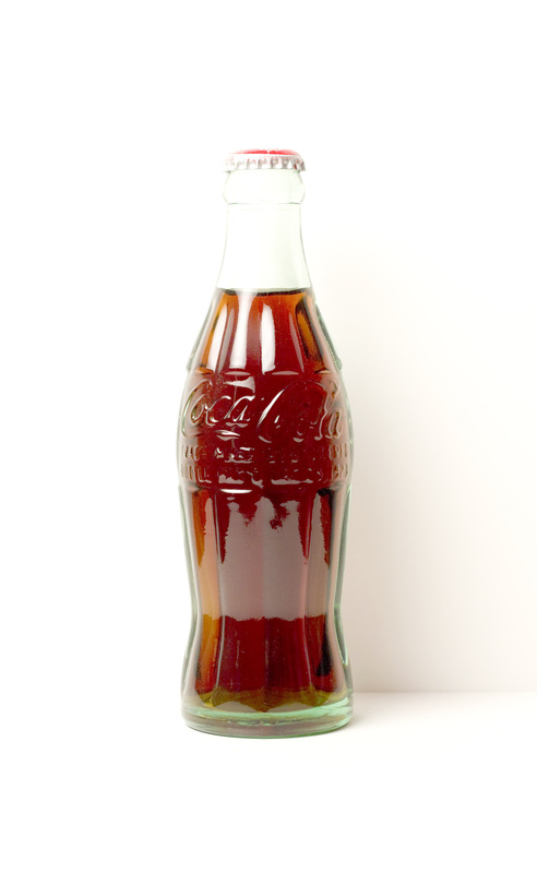
Above are a few photo references I used for a painting I did back in 2013. While determining how to light the coke bottle still life, I noticed the more light on the bottle, the more color there was. As you can see in the photos, as I gave the camera a longer exposure, a greater amount of light was able render an image on the camera sensor. This translated into more color. In my work I seek to make my paintings as real as possible so I chose to find a balance between the under saturation and over saturation of color. The second image is a proper exposure level and the one I used for the painting. But it was useful to see how the colors changed as more light was added.
|
|
As I mentioned before in other pages, I use halogen lamps in my studio. When I'm color matching my paint to my still life, good lighting is a must. Even though my lights have a color temperature between 2900 - 3000K, I have never struggled to get accurate colors. No matter what color you are trying to match, if you can do so correctly, your mix of paint will always match your reference in any type of light, warm or cool. As I said earlier you need an appropriate amount of light to see the color accurately. There really isn't a correct amount of illumination, but I can give you a guideline of what I use. When I paint, I illuminate my painting using PAR30 wide flood lamps from 4 feet away that supply 2000 - 3000 lumens. If I used a standard bulb with a reflector, I would need about 4000 - 6000 lumens. Check out my article Standard Bulb Vs PAR Flood Light to see the difference. I must mention I use the same kind of lights for the painting and the still life; this is important. Always use the same type of light with the same color temperature to illuminate your painting as well as the subject. Failing to do so will make judging color relationships near impossible.
|
To conclude this page, above are four images of two color swatches I mixed under the warm light in my studio and photographed it in different locations with different light. The bottom swatch of paint is my original color. It consists of dioxazine violet, thalo blue, thalo green, burnt sienna, and titanium white. The top swatch is my attempt to remix these five colors to match the original color. If its true you cannot accurately match colors in unbalanced light, then the two mixes of color will look different from each other once you show it in another light. However, as you can see, the color swatches match in all locations! While the color of the blue paint differs under the type of light, the consistency between the two mixes of paint remains the same.
